Photo © Guido Torres Courtesy of Rojkind Arquitectos
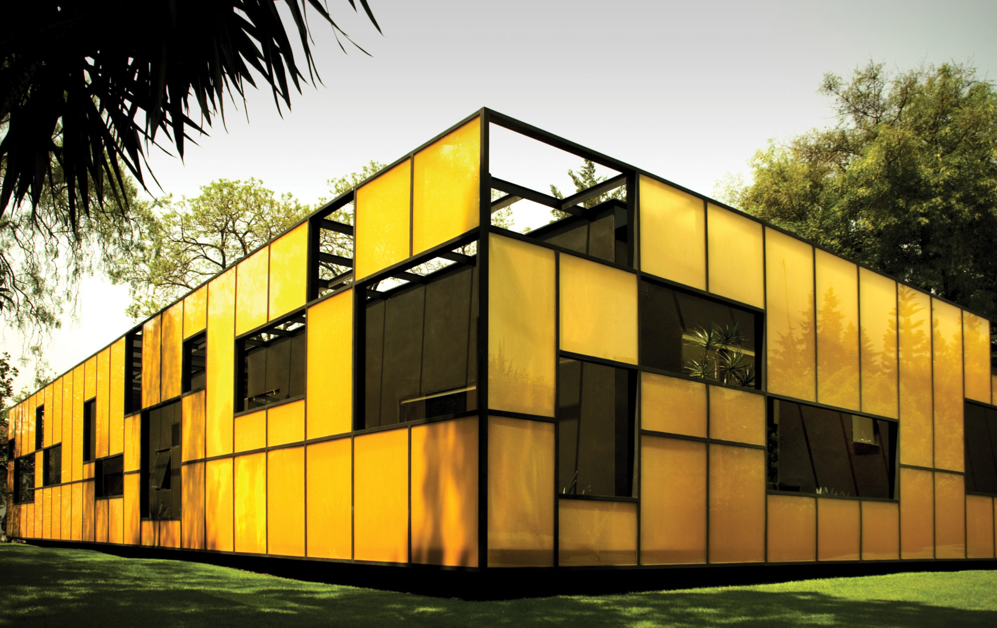
Falcón Headquarters is designed as a glass box floating in a garden, where interior and exterior blend together through carefully edited relationships between the space and the view.
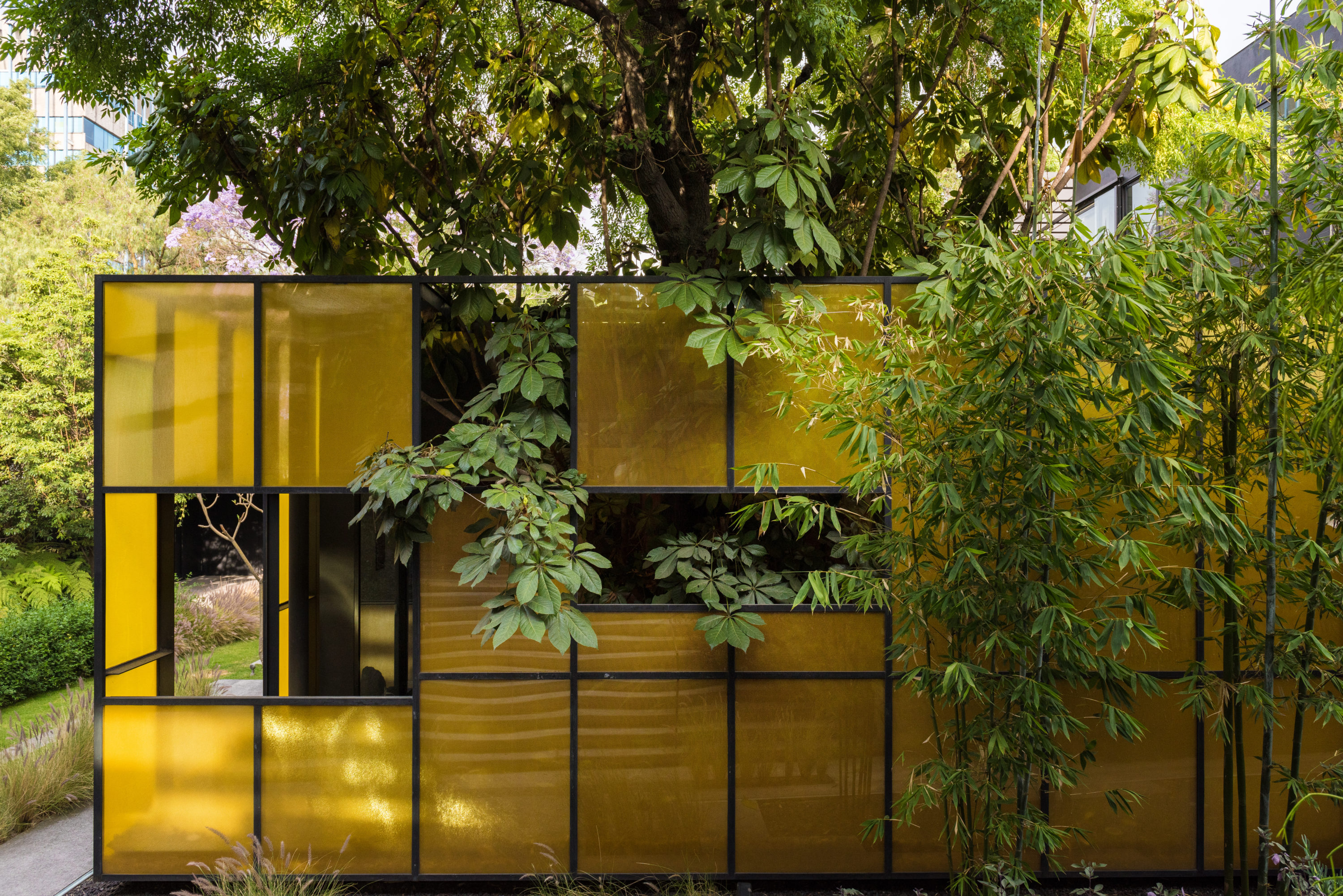
Photo © Jaime Navarro Courtesy of Rojkind Arquitectos
Michel Rojkind (Principal)
Agustin Pereyra (Project Manager)
Alejandra Elizarras
Gianpaolo Fusari
Sandra Carvajal
Structural Engineer
Moncad
MEP
Bertsol
Structural Steelwork
Ing. Jaime Lopez
Landscape Design
Ambiente Arquitectos
Builder
Factor Eficiencia: Fermin Espinosa
Photography
Guido Torres
Jaime Navarro
The company, Corporativo Falcon, dedicated to selling medical instruments and equipment, required new headquarters in Mexico City. The premise, besides the need for a larger area and a space designed to make their processes more efficient, was to cause a radical change to their business image through the building itself, in which the sales center would become not just a work area but also the ideal space to welcome clients and to portray their image as a high-tech business.
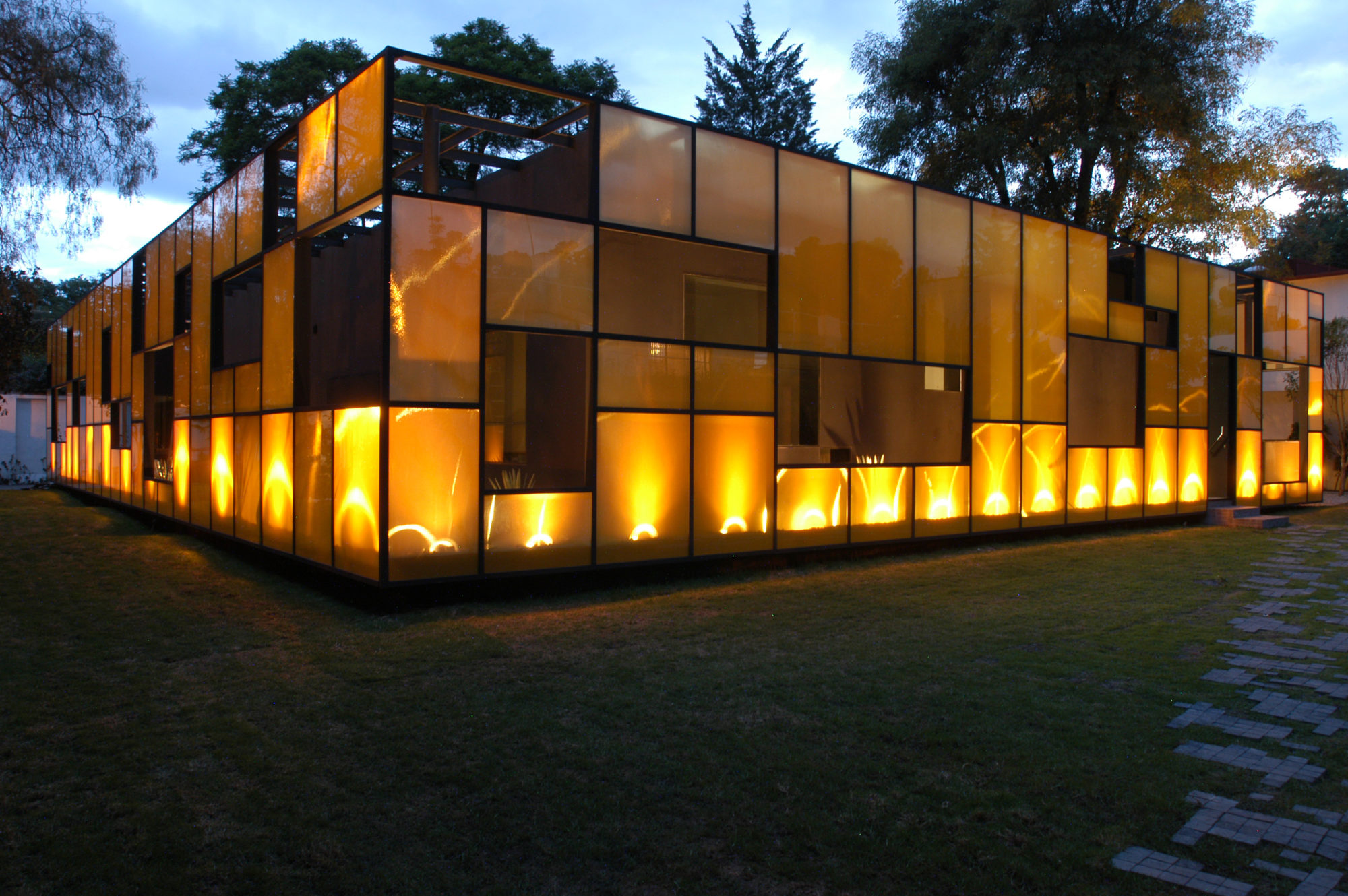
Photo © Guido Torres Courtesy of Rojkind Arquitectos
Site plan © Rojkind Arquitectos
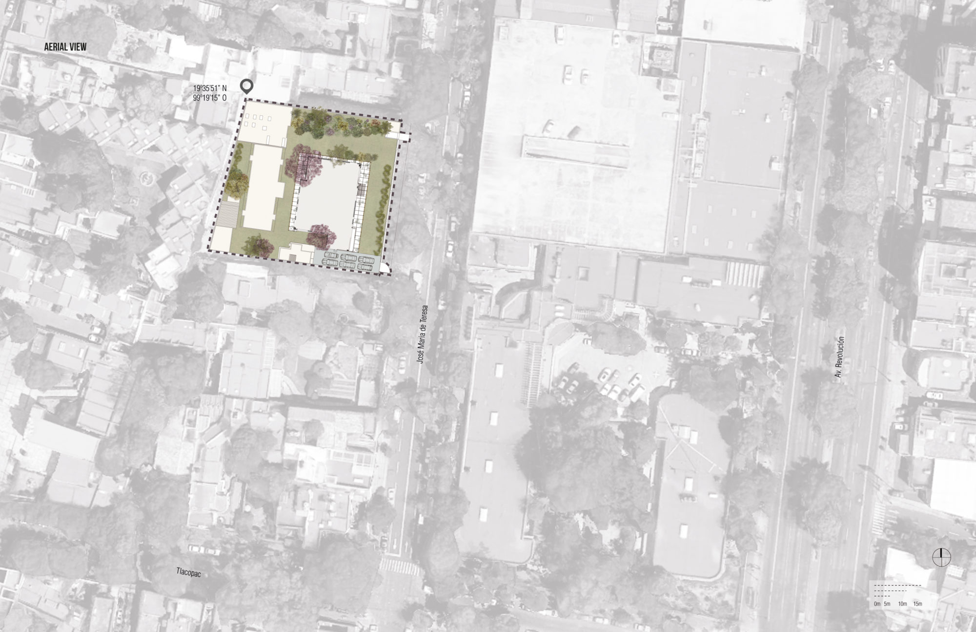
A 2,353 m2 property was acquired on a very quiet street in close proximity to the San Angel district. The property already had three buildings, two at the perimeter and the third and biggest one floating in the middle of the garden. Taking advantage of this layout, the different corporate areas were assigned, concentrating the sales area in the central building.
Based on the quality of the main construction, having a structure with evident gaps, the interior was cleared out and the project was conceptualized as a glass box floating in the garden. Focusing on the relationship between interior and exterior spaces, the glass skin was cast before the solid perimeter in order to create a filter between the polarity of these spaces.
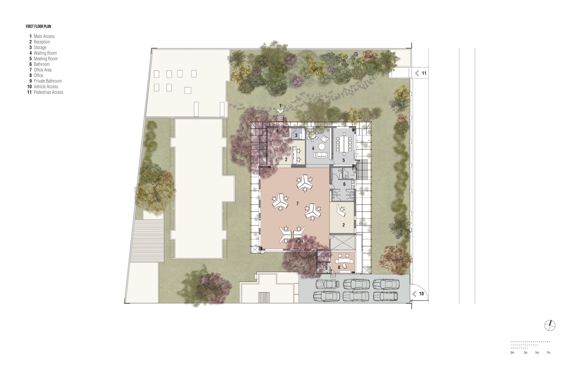
Plan © Rojkind Arquitectos
Subsequently, the relationship between these two was carefully edited, seeking the macrocosms that represent the fractions, or fragments, the branches, the stones, or a single cloud traveling across the sky. The translucent material, straws encapsulated in glass, creates a virtual sequence of exterior spaces and colors. The interior with orange lighting contrasts with the gray shades of paint and creates veils of color and reflections that transform or disappear in relation to the position in which it is observed.
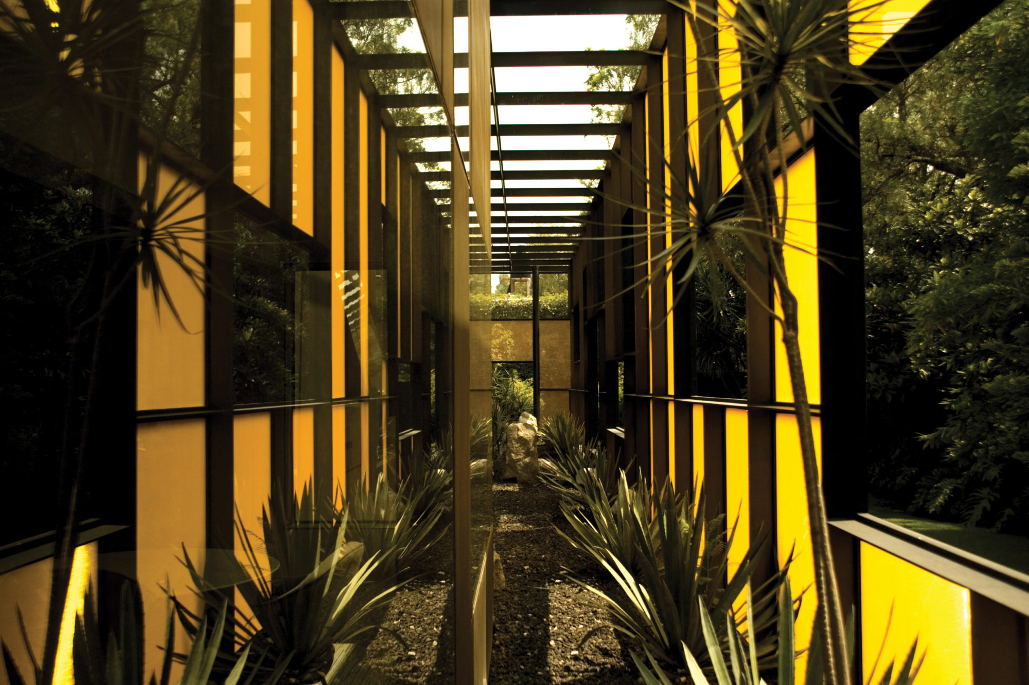
Photo © Guido Torres Courtesy of Rojkind Arquitectos
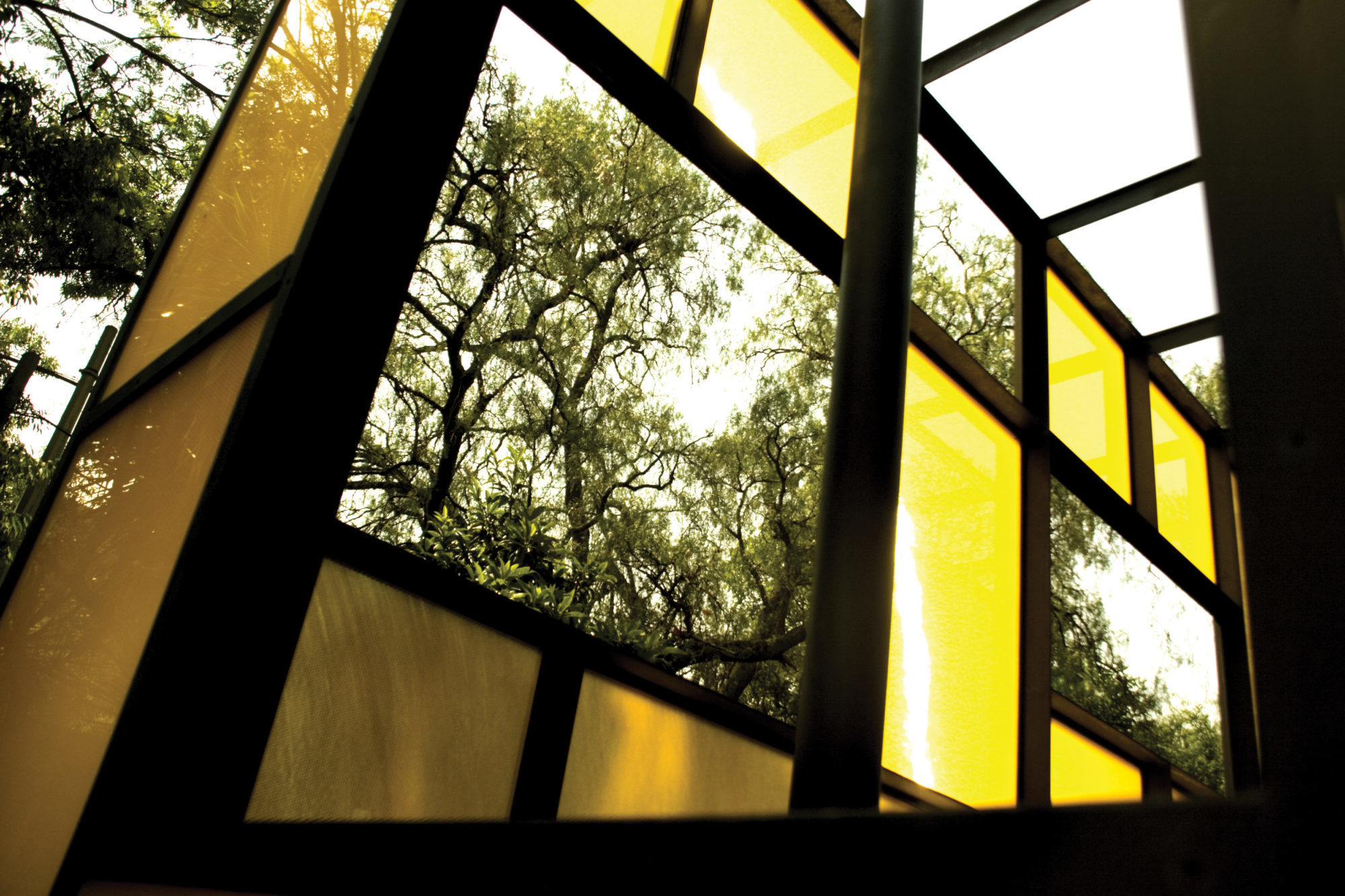
Photo © Guido Torres Courtesy of Rojkind Arquitectos
The perforations on the wall are in response to the search of editing the view, of losing the gravity that exists in traditional windows. They aim to have an apparently accidental, mysteriously cut and illuminated view of the exterior that is capable of challenging gravity, as if looking through the branches of a tree. In this manner, both skins are perforated as they are being unfolded, using this metaphor as the ideal relationship between the business and its clients.
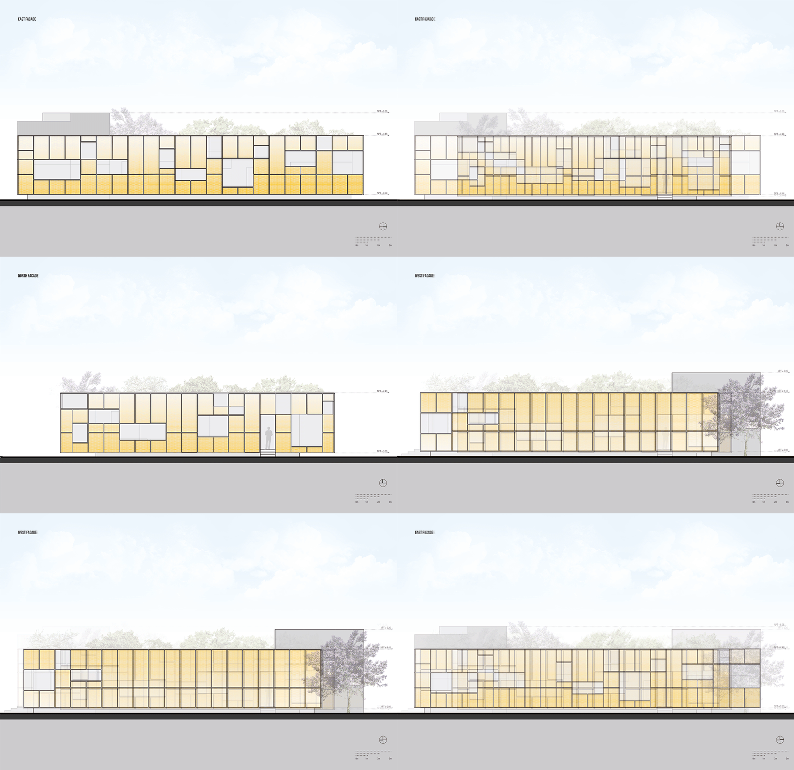
Elevations © Rojkind Arquitectos
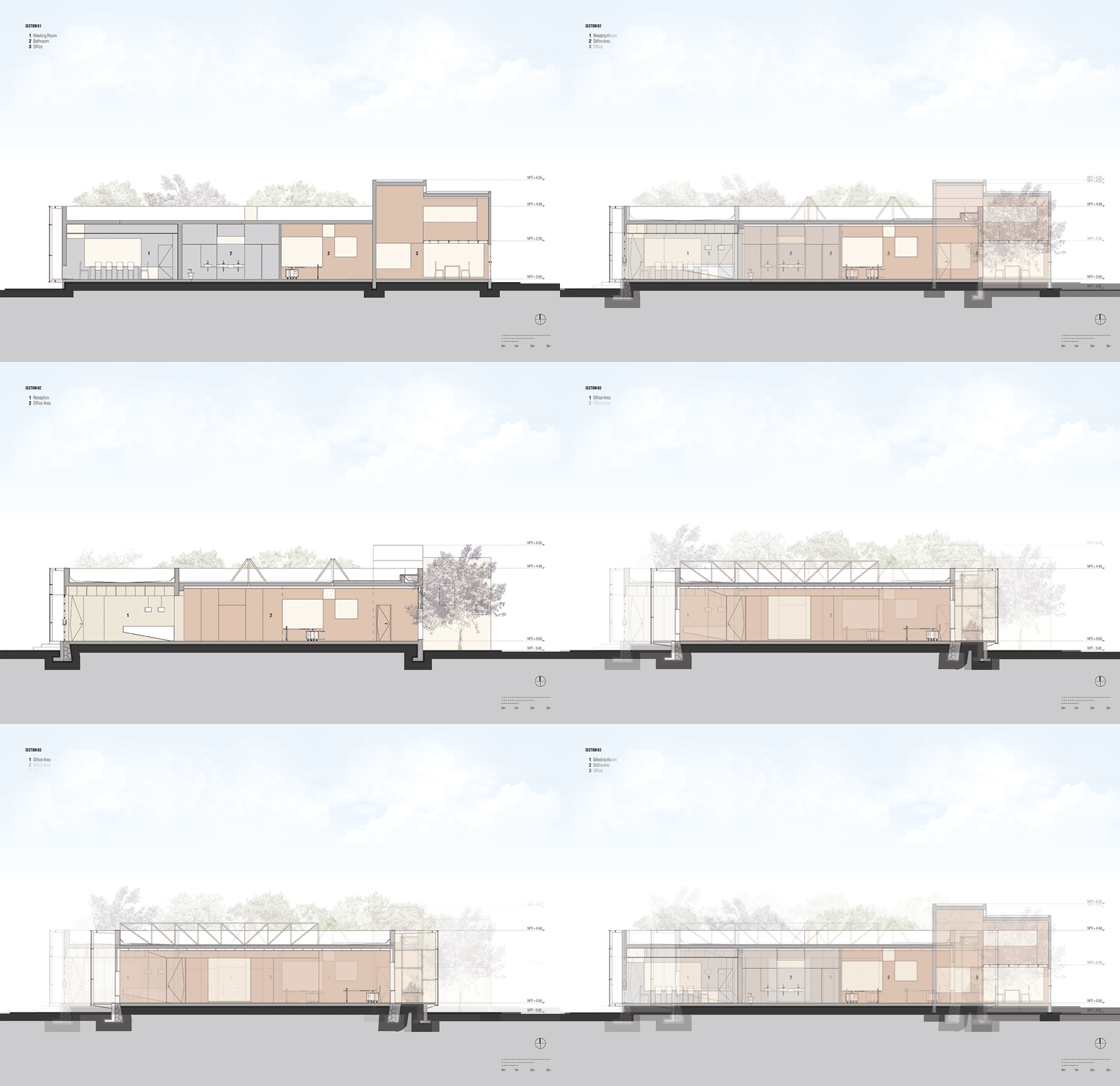
Sections © Rojkind Arquitectos
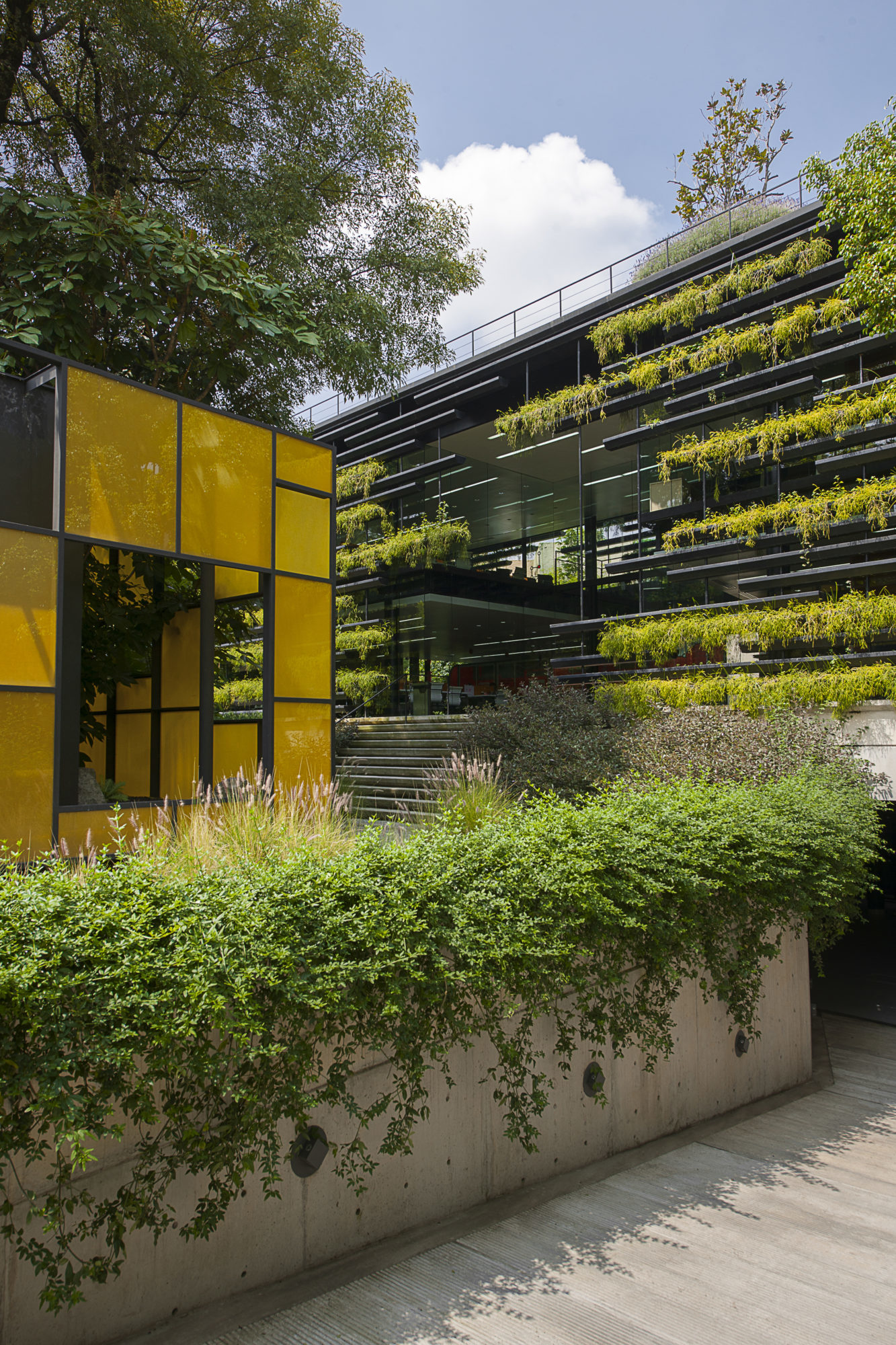
Photo © Jaime Navarro Courtesy of Rojkind Arquitectos

rojkindarquitectos

rojkindarquitectos

rojkindarquitectos

rojkindarquitectos

rojkindarquitectos

rojkindarquitectos

rojkindarquitectos

rojkindarquitectos