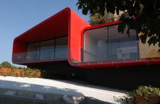
Photo © Paul Rivera Courtesy of Rojkind Arquitectos
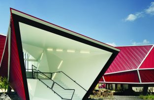
Nestlé Application Group is a game of contrasting opposites in regards to form, material, and color. With clarity and force, it introduces performance and theatrical qualities to industrial architecture.
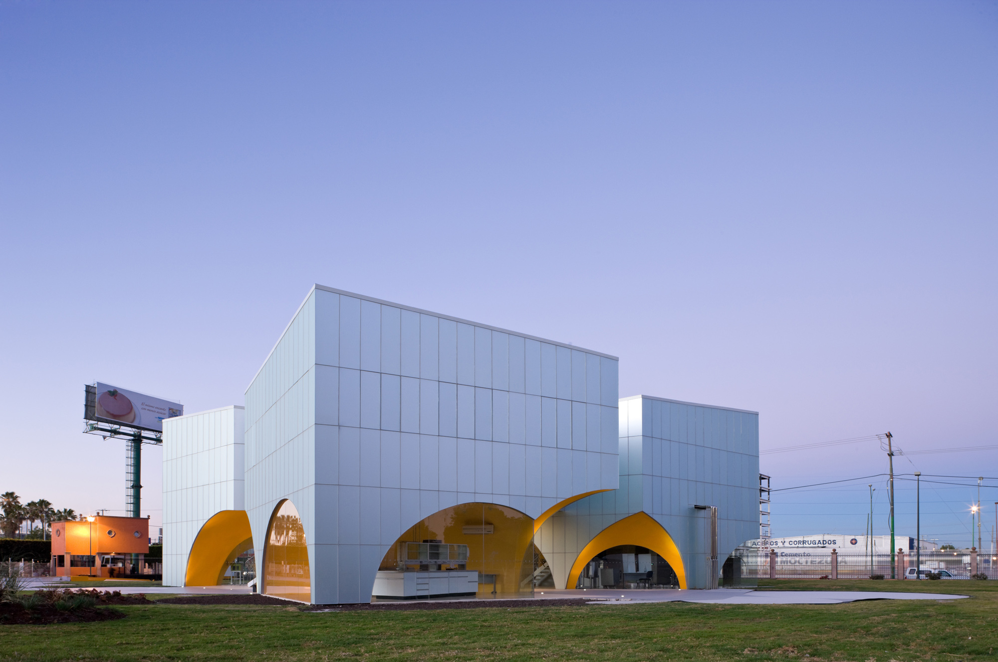
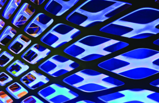
Photo © Iwan Baan Courtesy of Rojkind Arquitectos
Agustin Pereyra (Project Manager)
Paulina Goycoolea
Isaac Smeke
Moritz Melchert
Juan Carlos González
Andres Altesor
J. Espinosa
Francisco Gordillo
J. Espinosa
Tomas Kristof
Tere Levy (Marketing)
Structural Engineer
Ing. J Felipe Heredia
Façade Engineer
Vycisa
MEP
Quantum Diseño
Rendering
Rojkind Arquitectos
Photography
Iwaan Baan
Paul Rivera
In his “A Concrete Atlantis,” Reyner Banham posits “a casual connection, conscious and cultural, between modern architecture and industrial utilitarian structures of an industrial epoch.” From Loos and Behrens to Gropius and Le Corbusier, at the beginning of the 20th century, a constant back and forth was established between architecture and industrial construction—until now, marginalized in architecture—that would continue to be a characteristic of contemporary architecture. Architecture was tasked to reinvent the industrial world, understood as the invention of an image that moves between the operative logic and the logotype.
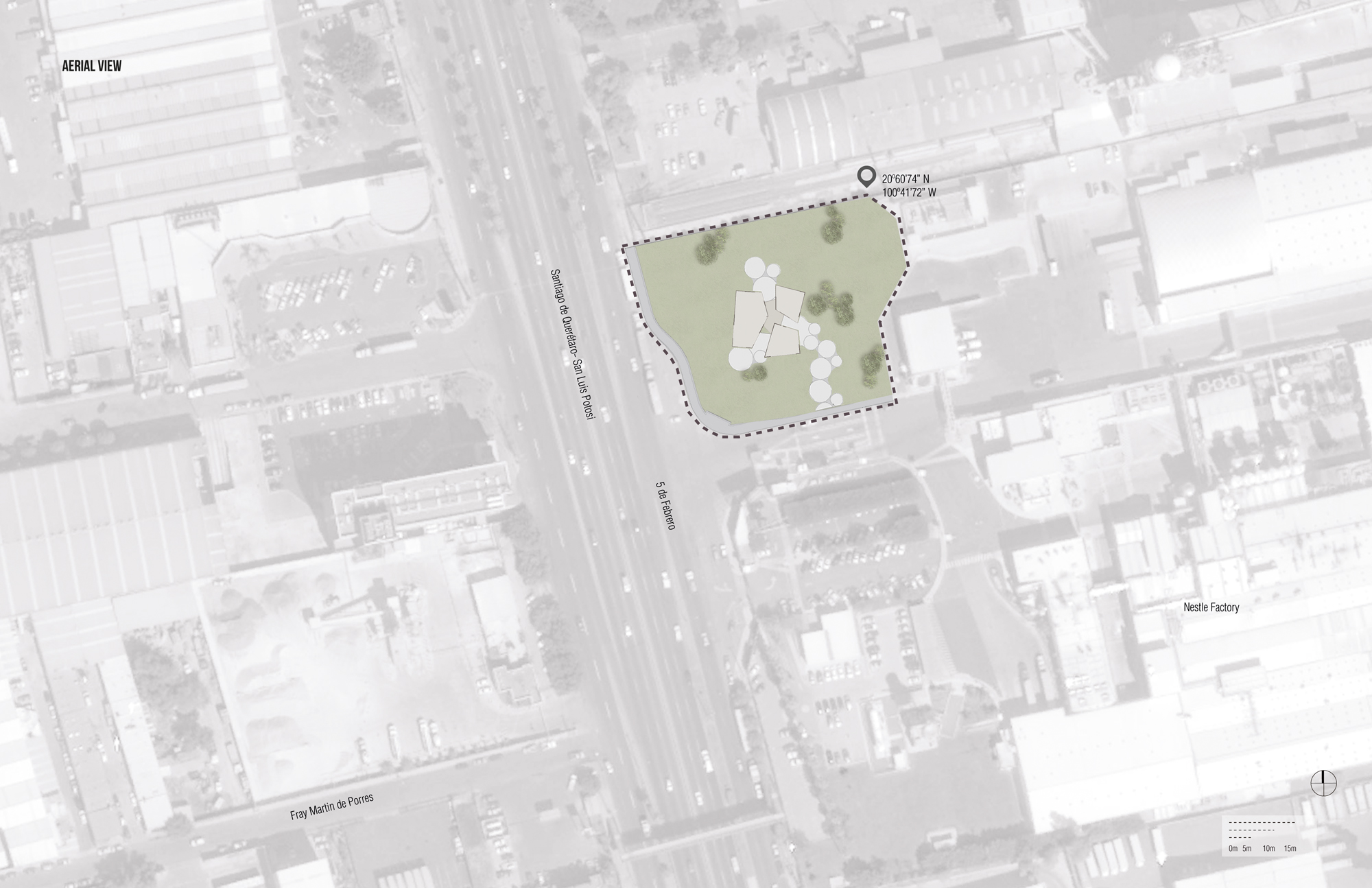
Site plan © Rojkind Arquitectos
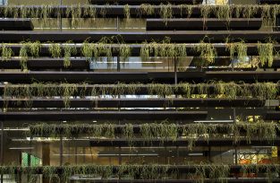
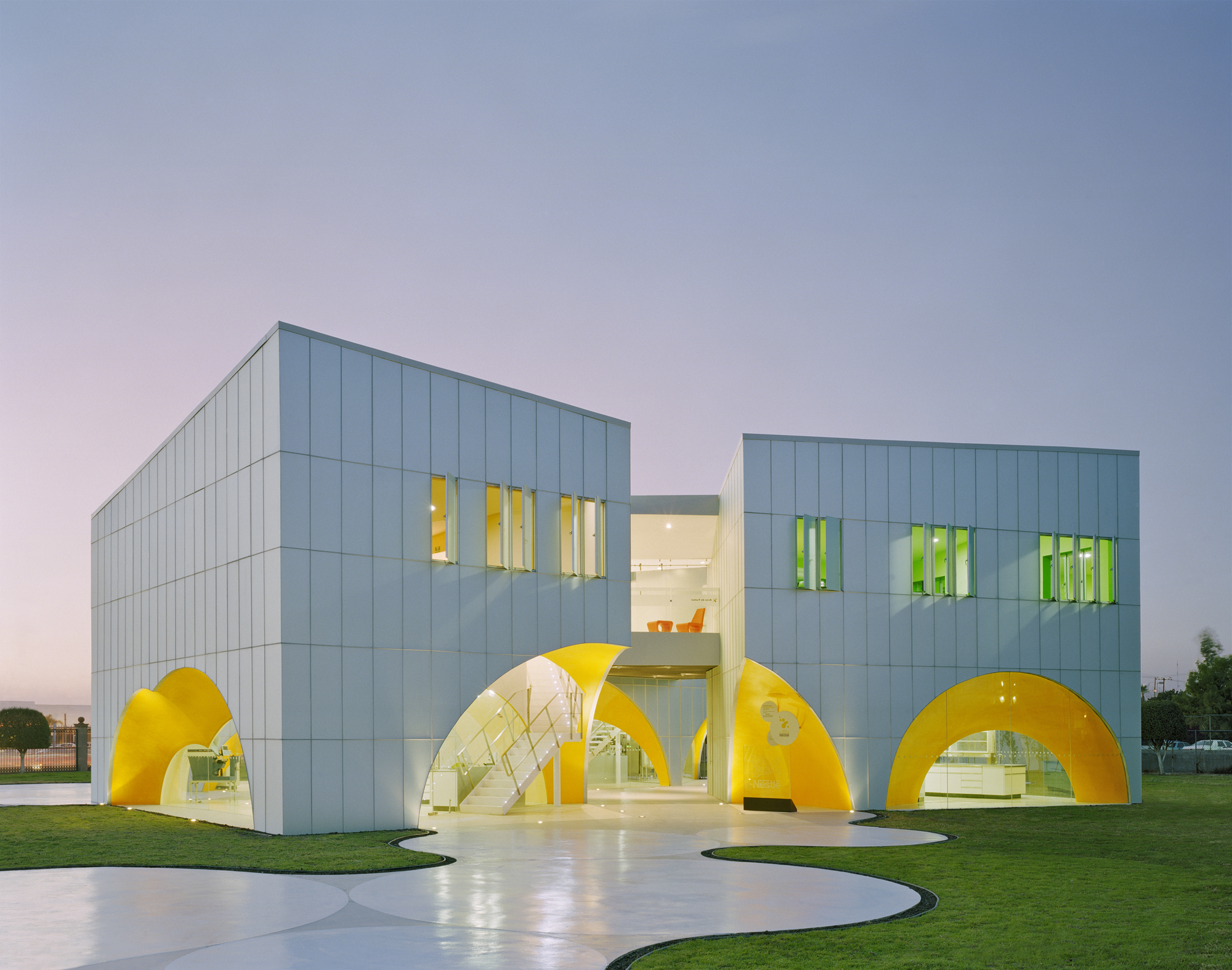
Within this framework lays the work that Rojkind Arquitectos has done for a pair of factory additions for the Nestlé Company. The first commission consists of a vestibule for one of its chocolate factories in the outskirts of Toluca, near Mexico City. It is a structure of sloped plains attached to the existing factory that serves as the central core for a future museum. The second commission located in Queretaro’s industrial zone is a laboratory for development of new products, packaging center, and a satellite office for its product technology center located in Maryville that focuses on the development of new drinking products.
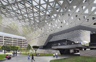
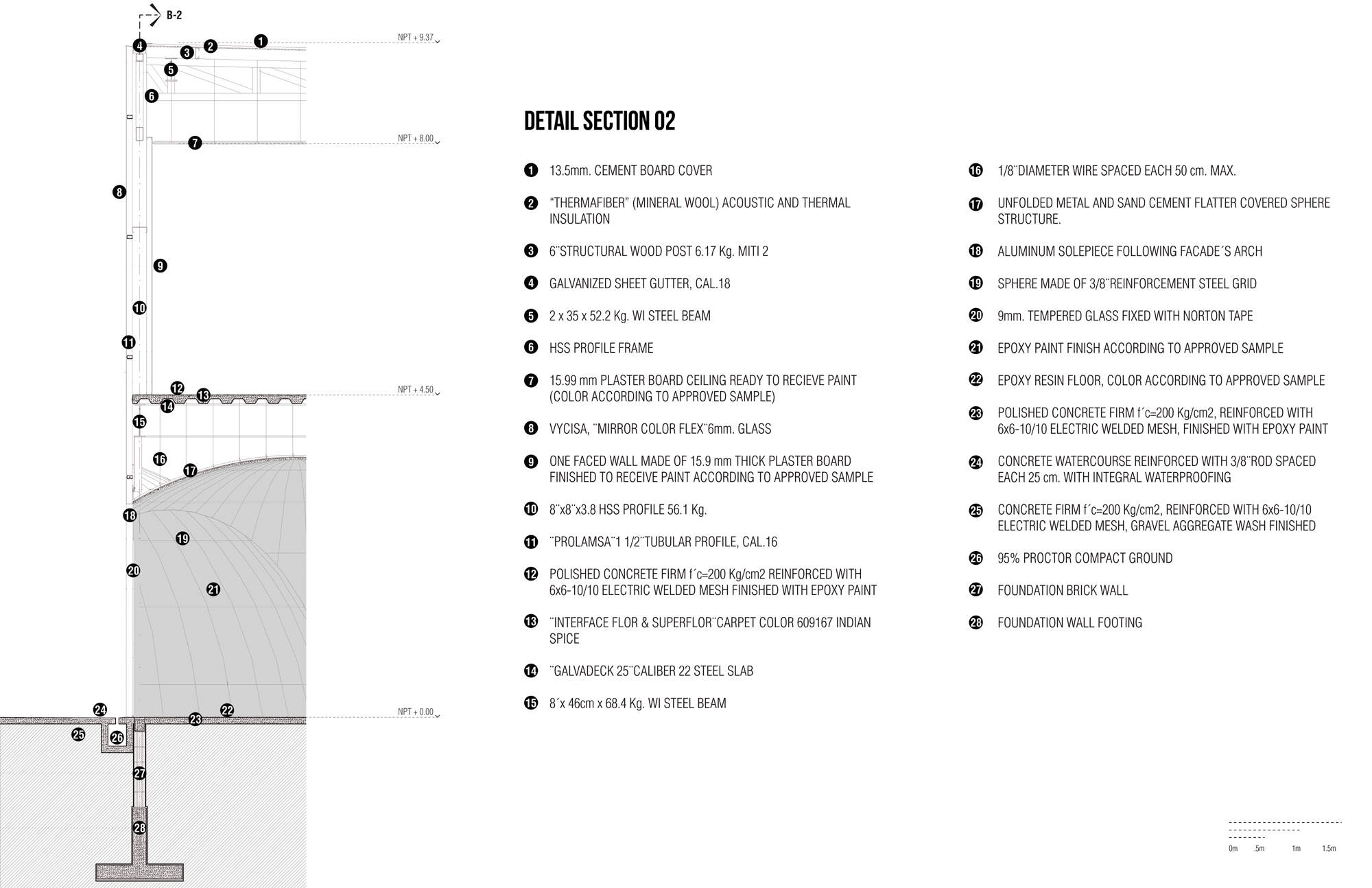
This latter commission presented an additional challenge besides its relationship with the existing facility. The UNESCO’s designation of Queretaro’s historic city center as a World Heritage Centre in 1996 had unforeseen consequences that even expanded to the city’s industrial periphery. As a result of this designation, the new building was to have an arched porch, as rooted in tradition. Rojkind Arquitectos responded to this challenge with a reinterpretation not only of the arch but also of the porch. If the arch is nothing else than a fragment of a cupola, in the same vein, the cupola is an amplified arch when it rotates around its own axis. The cupola meets the reference criteria of the arch without turning it into a cliché. In this case, a series of spheres intersect and multiply like foam forming the origin of a continuous open space, a portico. This space expands while another one, made of orthogonal boxes clad in satin-mirrored glass, restrains the proliferation of the spheres and houses the specific program requirements for the lab.
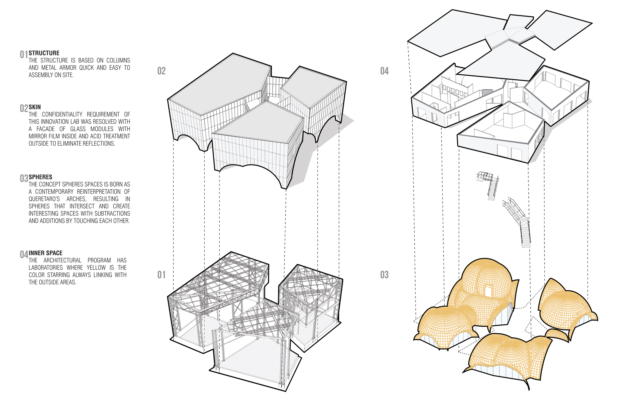
Project diagram © Rojkind Arquitectos
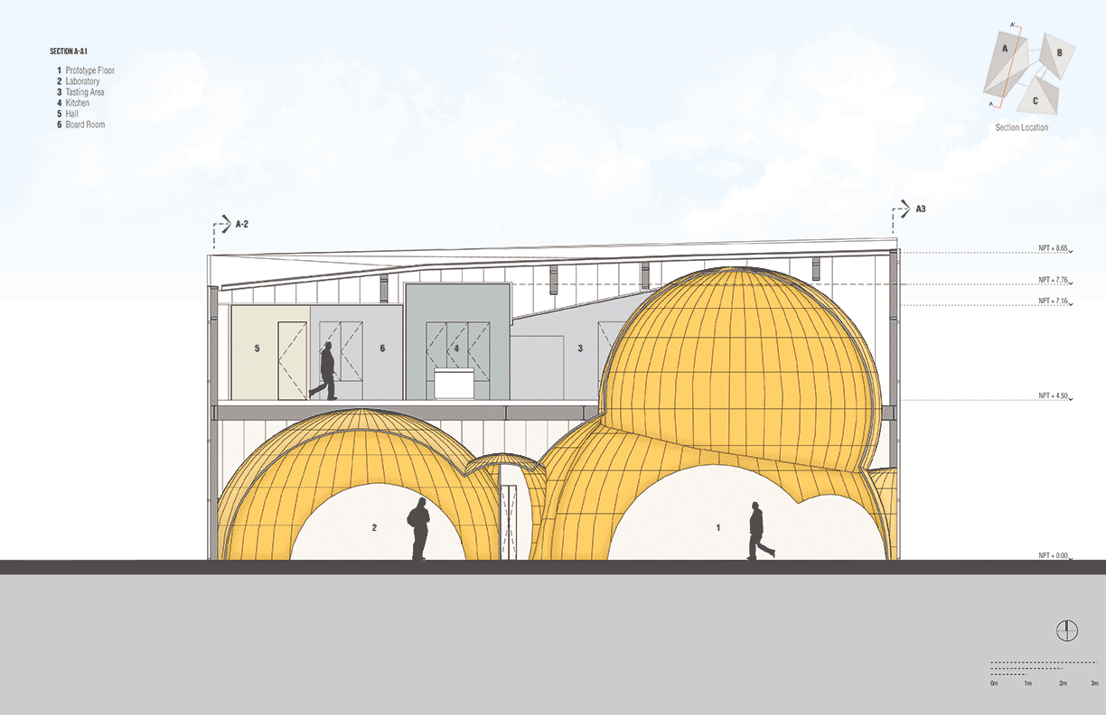
Sections © Rojkind Arquitectos
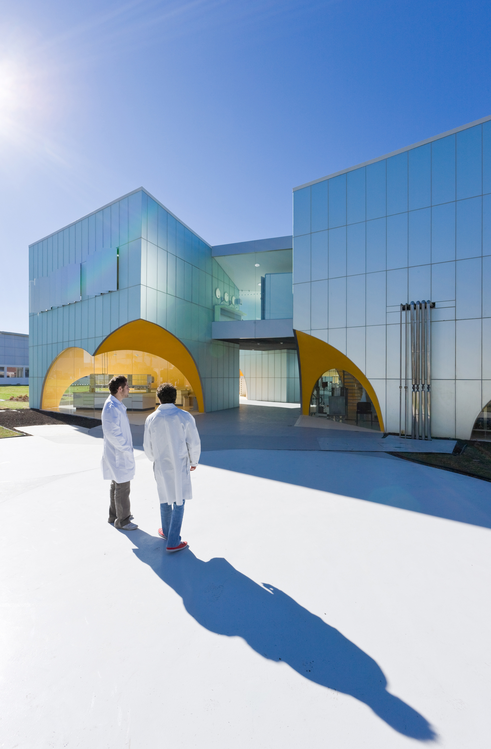
Photo © Iwan Baan Courtesy of Rojkind Arquitectos
While the exterior is opaque, metallic, and impenetrable in appearance, the interior of these boxes painted in different colors, have an almost theatrical quality to them. It appears as if the researchers wearing their white robes were floating in a continuous flow of blues, yellows, and greens that are occasionally interrupted by the intersection of different colors. When one of the of the metal panels that covers the boxes reveals itself and opens like a window, they can be seen from the outside.
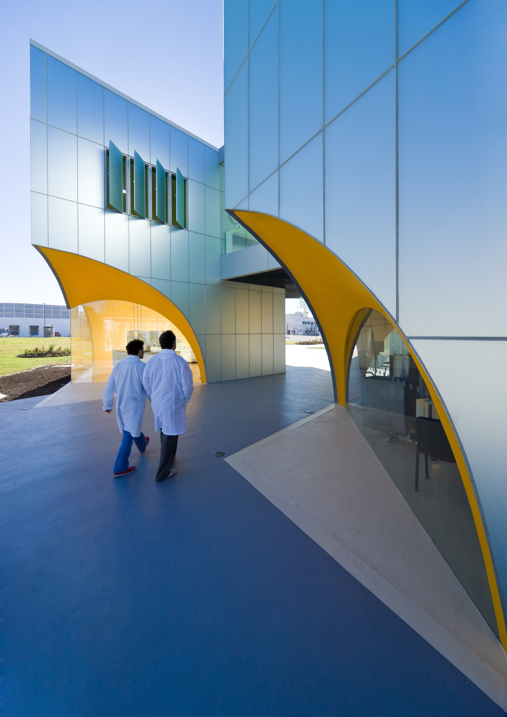
Photo © Iwan Baan Courtesy of Rojkind Arquitectos
Construction © Rojkind Arquitectos
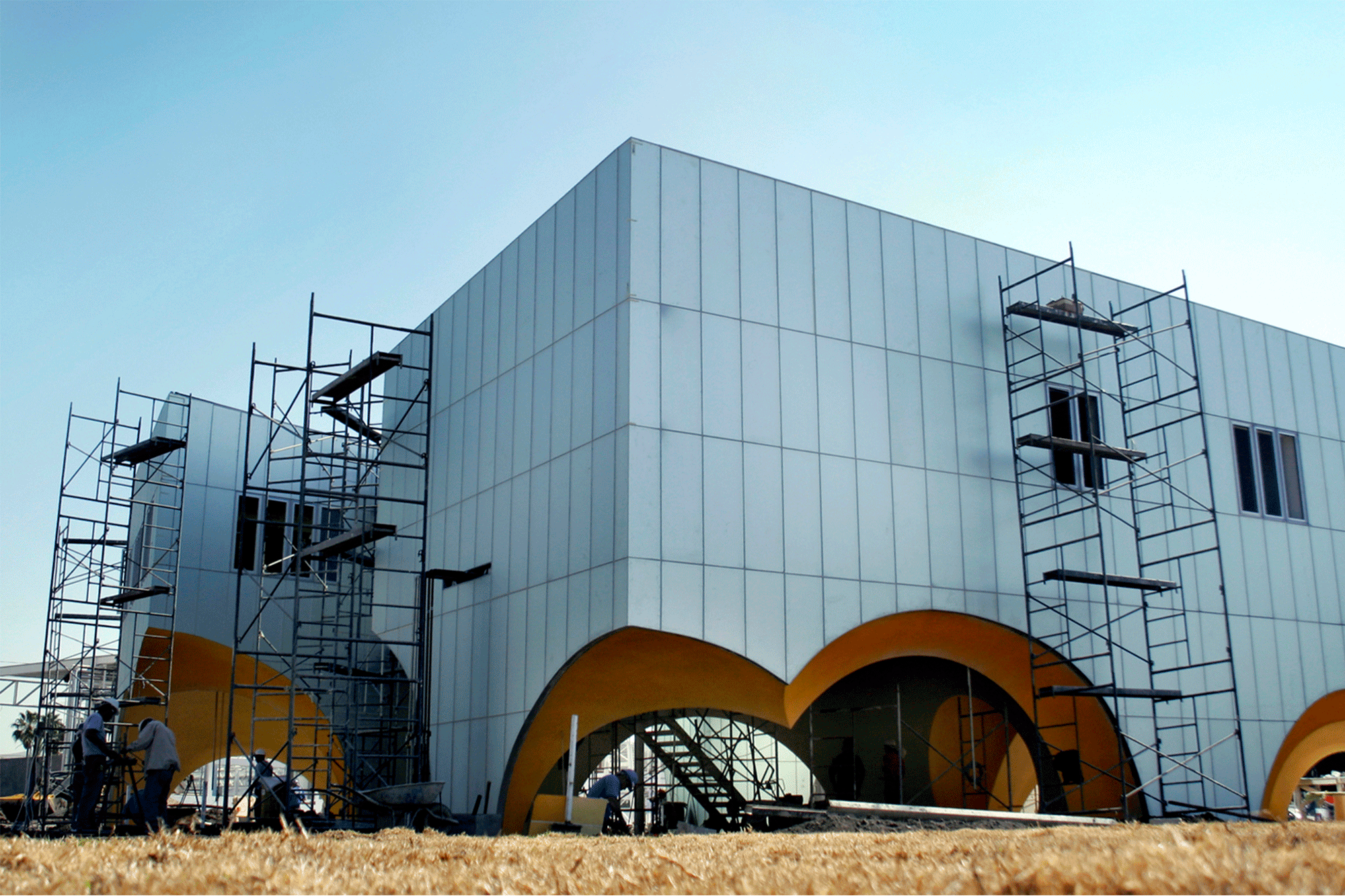
If it had been built elsewhere, a more sophisticated technology most likely would have had been employed to automatize the production of the unique geometries of these spheres. Here, the construction of these buildings implied the translation of spatial forms was to be done in a different constructive manner, in a simple almost colloquial way. It allowed the local workers to fabricate the foam like spherical space from the physical intersection of the spherical cupolas made of rebar rings and arches.

Façades © Rojkind Arquitectos
Façade detail © Rojkind Arquitectos
The final result is a series of contrasts that has been unified with apparent simplicity: the exterior metallic is a slightly reflective satin color that lightly contrasts with and against the bright and satin colors of the interiors. The sloped abstracted planes of the boxes contrast against the exuberance of the interweaving spheres. The strength of this project might be attributed to this game of contrasting opposites, which in a dynamic and changing way depending from the physical view of the observer can be a dominant characteristic in a moment or a discrete characteristic in another. A rethought and recharged industrial construction thus regains an understanding of what it once offered to architecture: clarity and force.
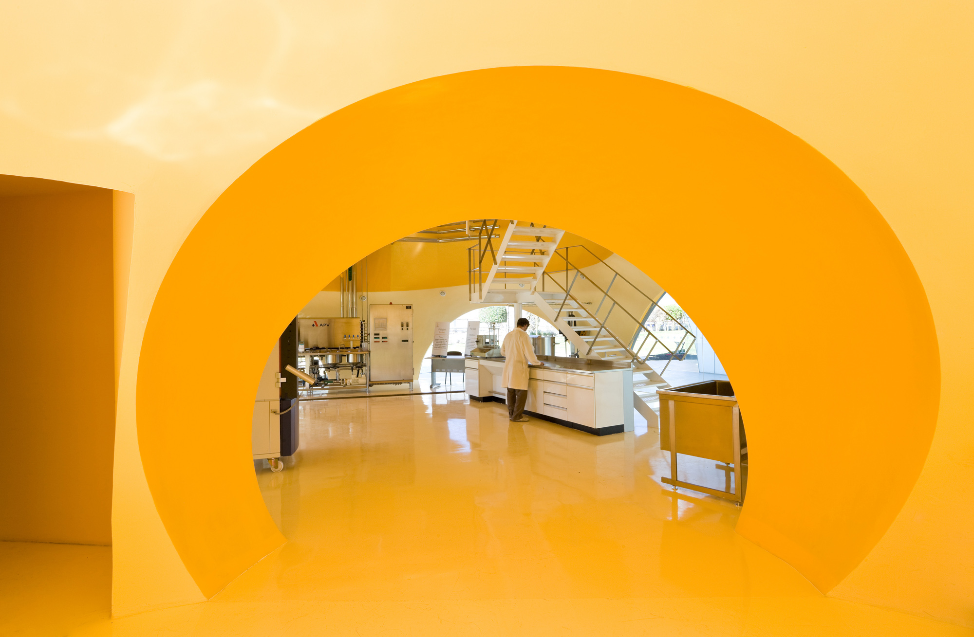
Photo © Iwan Baan Courtesy of Rojkind Arquitectos