Render © Glessner Group Courtesy of Rojkind Arquitectos
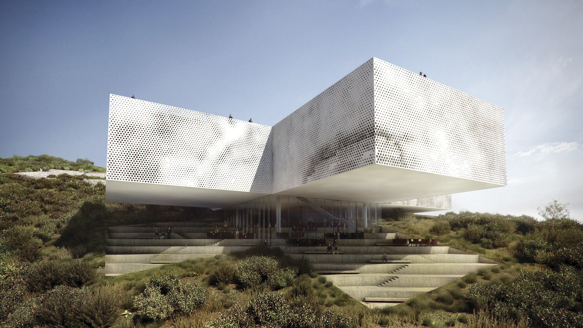
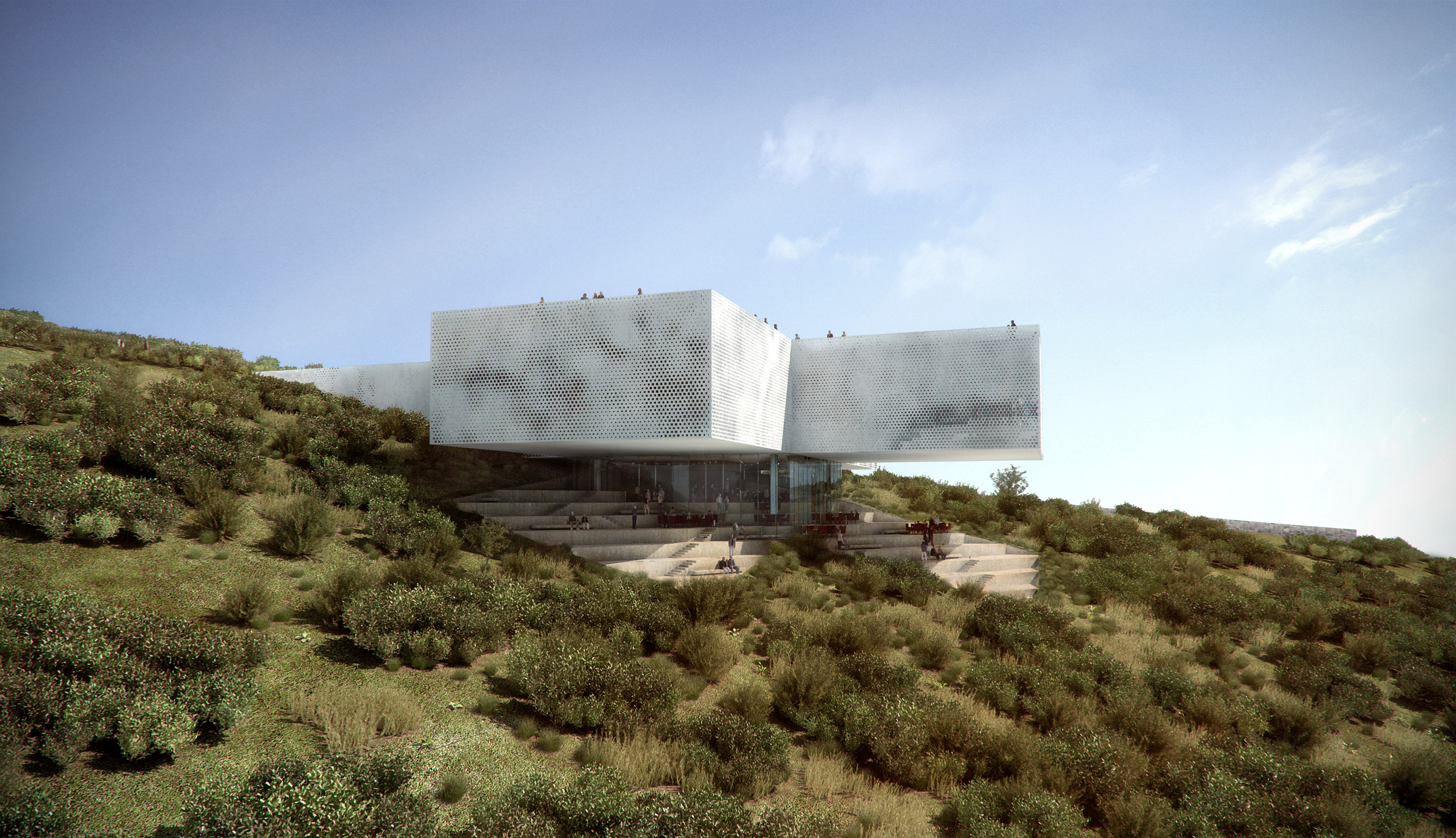
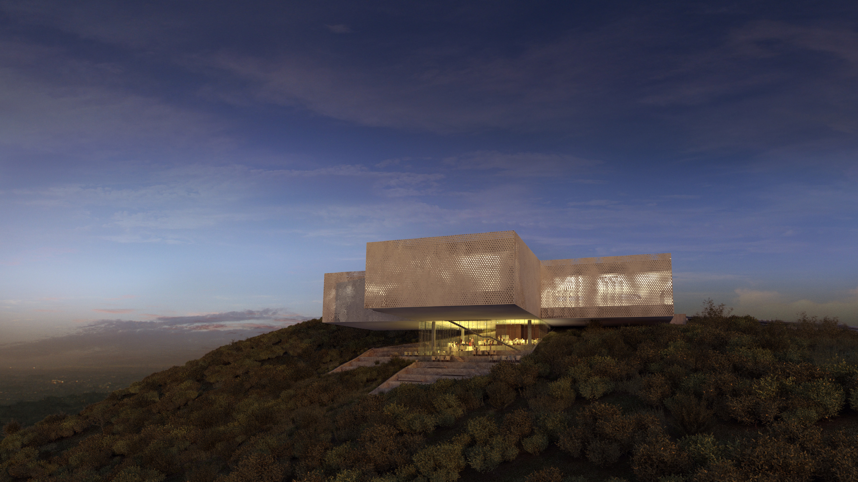
Set upon a steep hillside in Atizapan on the outskirts of Mexico’s largest metropolis will soon sit the New Tamayo Museum which will serve as a nucleus of education and culture, locally, regionally, and internationally.
Michel Rojkind (Principal)
Agustín Pereyra (Project Manager)
Mónica Orozco
Juan Carlos Vidals
Fernanda Gómez
Isaac Smeke
Beatriz Diaz
Juan José Barrios
Joe Tarr
Roberto Gil
Tere Levy (Media)
BIG
Bjarke Ingels (Principal)
Andreas Klok Pedersen (Partner)
Graphic Design
Ernesto Moncada
Renders & Video
Glessner Group
Named after the Oaxacan born artist Rufino Tamayo (1899-1991), the very strong and symbolic shape of the cross is a direct interpretation of the client’s preliminary program studies that defined the museum’s optimal functionality.
Render © Glessner Group Courtesy of Rojkind Arquitectos
Plans © Rojkind Arquitectos
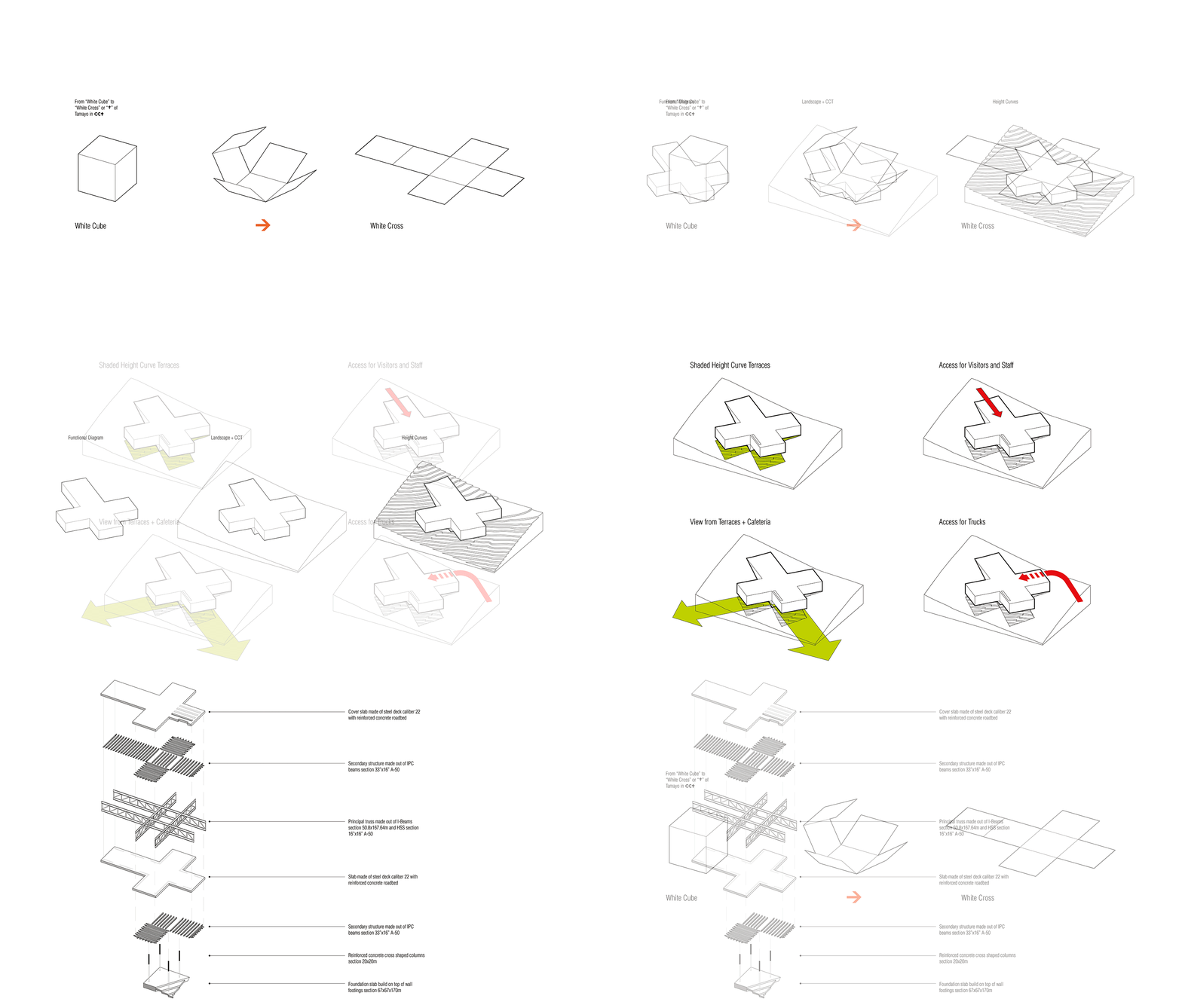
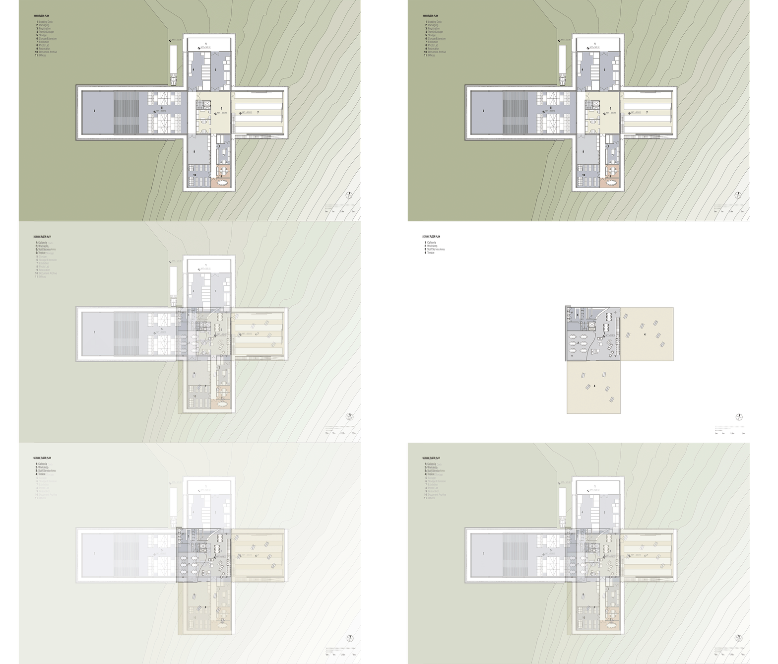
The main concept of Tamayo Museum Atizapan Extension is an “open box” that unfolds, opens and invites the visitors inside. Package, restoration and storage will serve as additional cultural spaces for visitors to understand the stages that an art piece goes through in order to get to its specific destination.
Plans © Rojkind Arquitectos
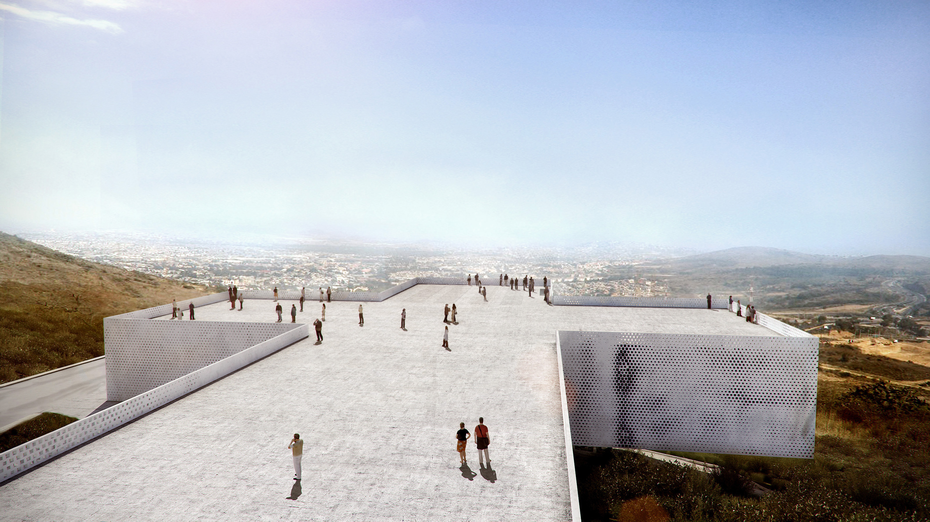
This is an overwhelming, direct, strong and symbolic project, where the shape derives from the client’s preliminary studies that defined the optimal functionality and was then enhanced by taking advantage of the best views from above, making the best of the steep terrain and shading the more social program below, exterior and interior spaces overlap to provide the best environment possible for each function, and optimal climatic performance.
Render © Glessner Group Courtesy of Rojkind Arquitectos
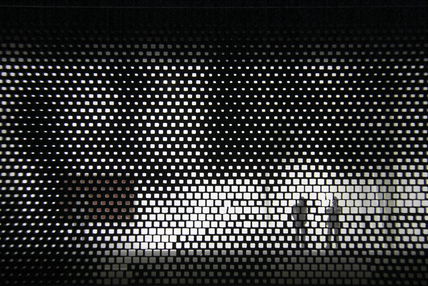
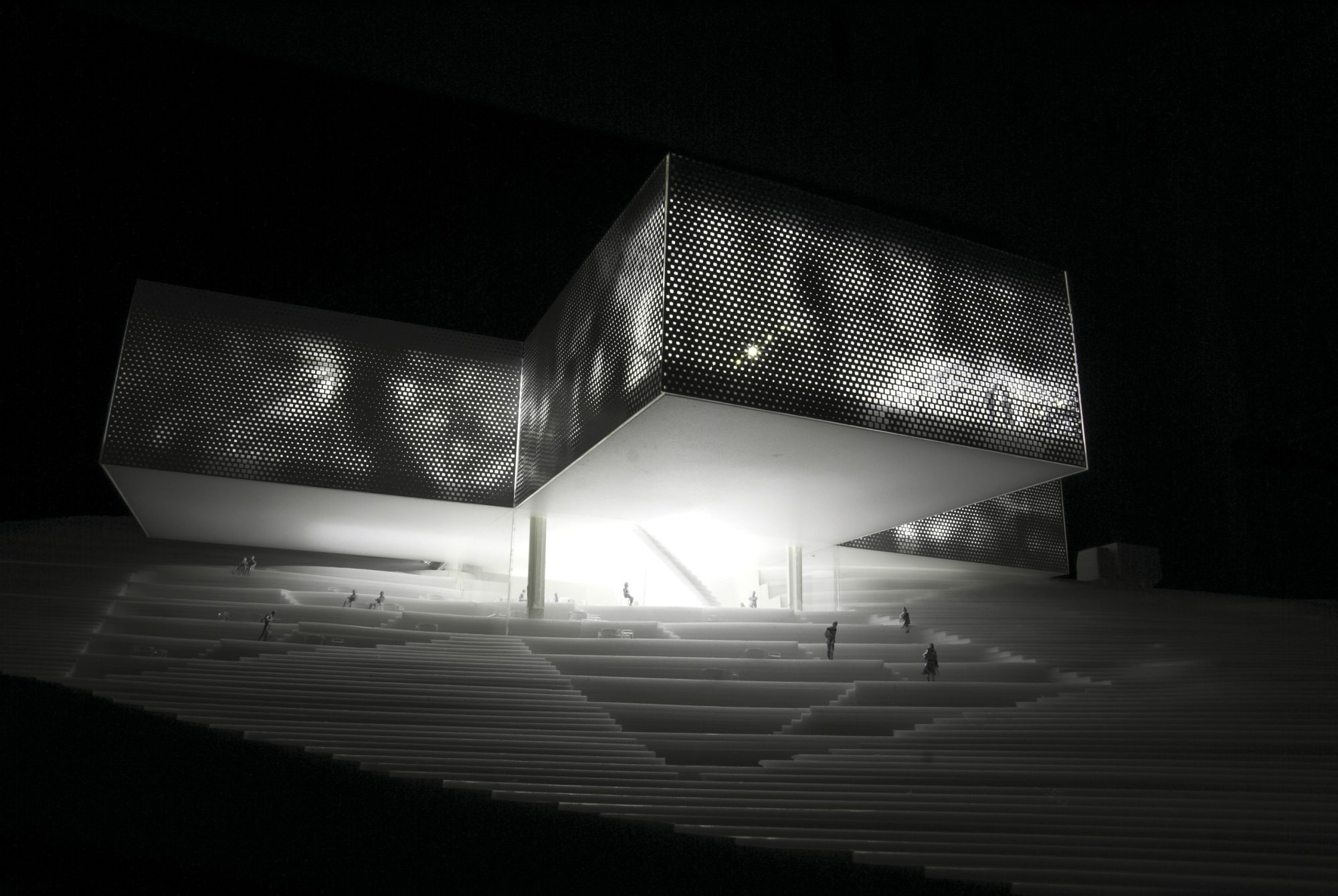
The permeable brick shading façade eliminates or reduces the need for AC and combines good daylight with no sunshine and plenty of natural ventilation. However, it will be the museum’s symbolic provocation of its form and content that will attract its visitors, once there, they will discover that its design, though modest, is intelligently and sustainably planned.
Model © Rojkind Arquitectos
Model © Rojkind Arquitectos
Render © Glessner Group Courtesy of Rojkind Arquitectos
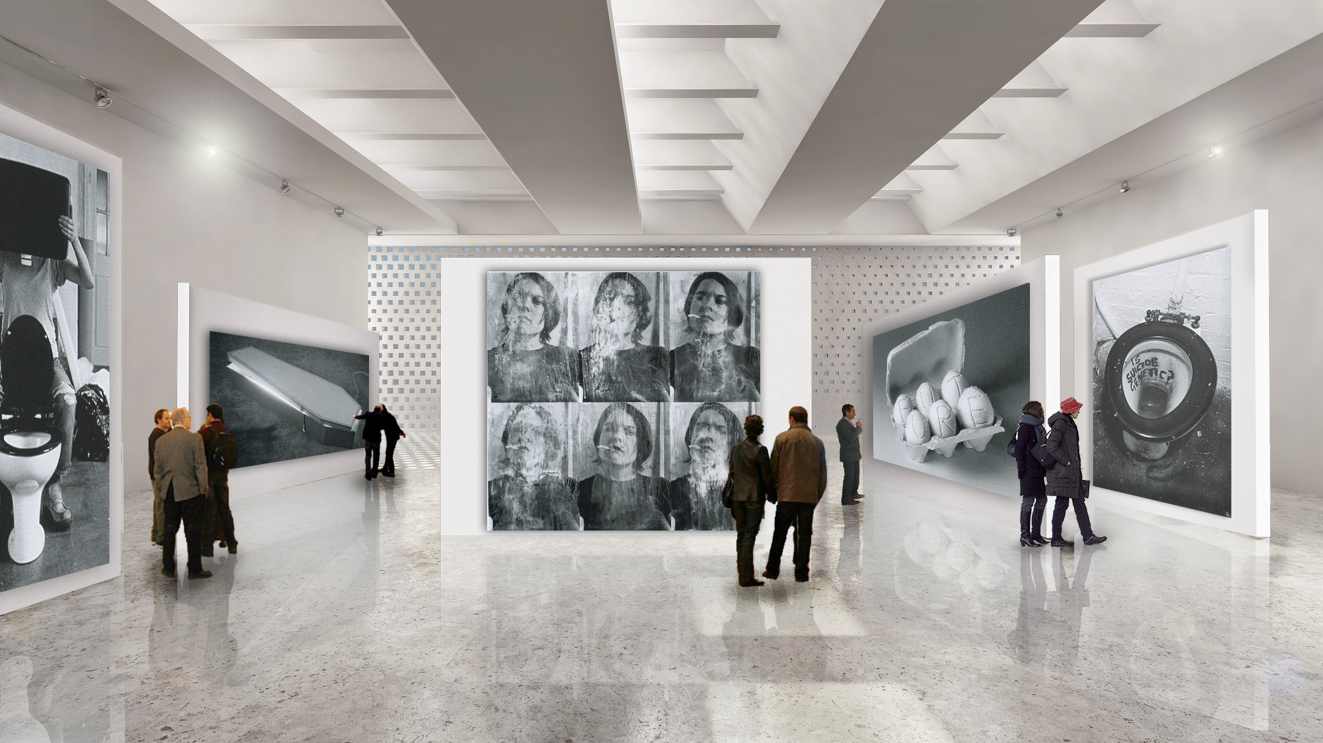
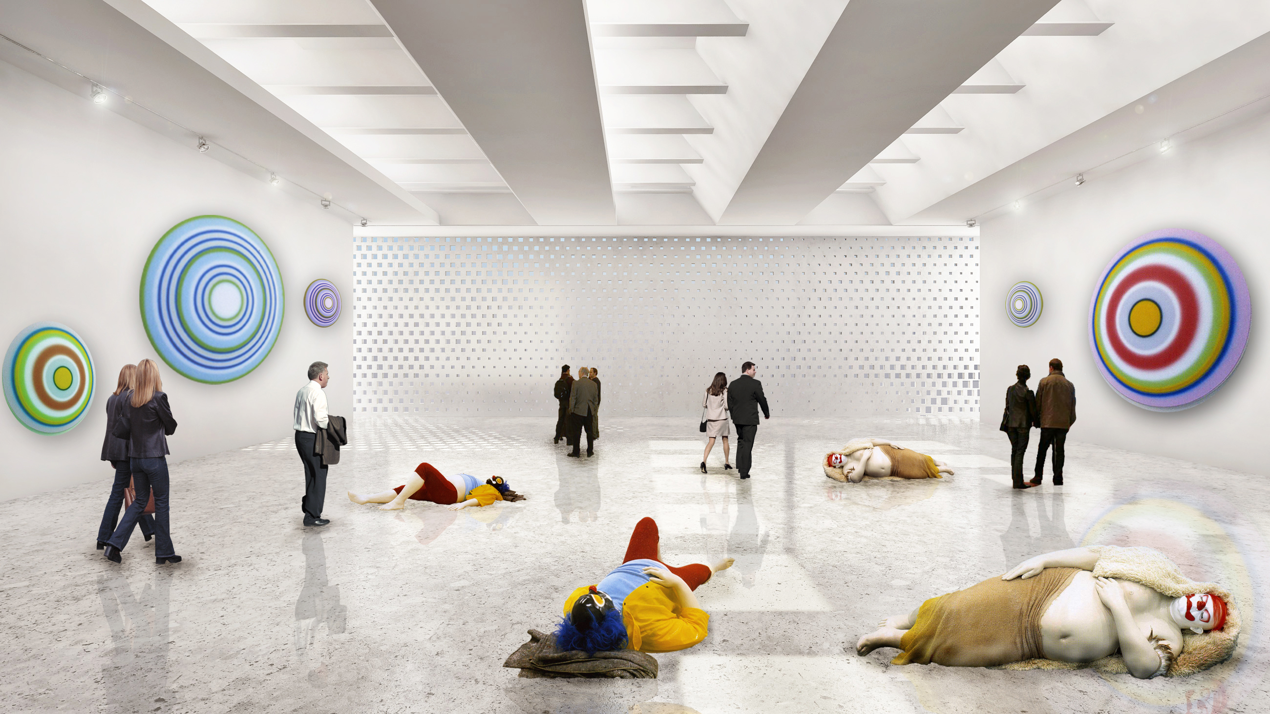
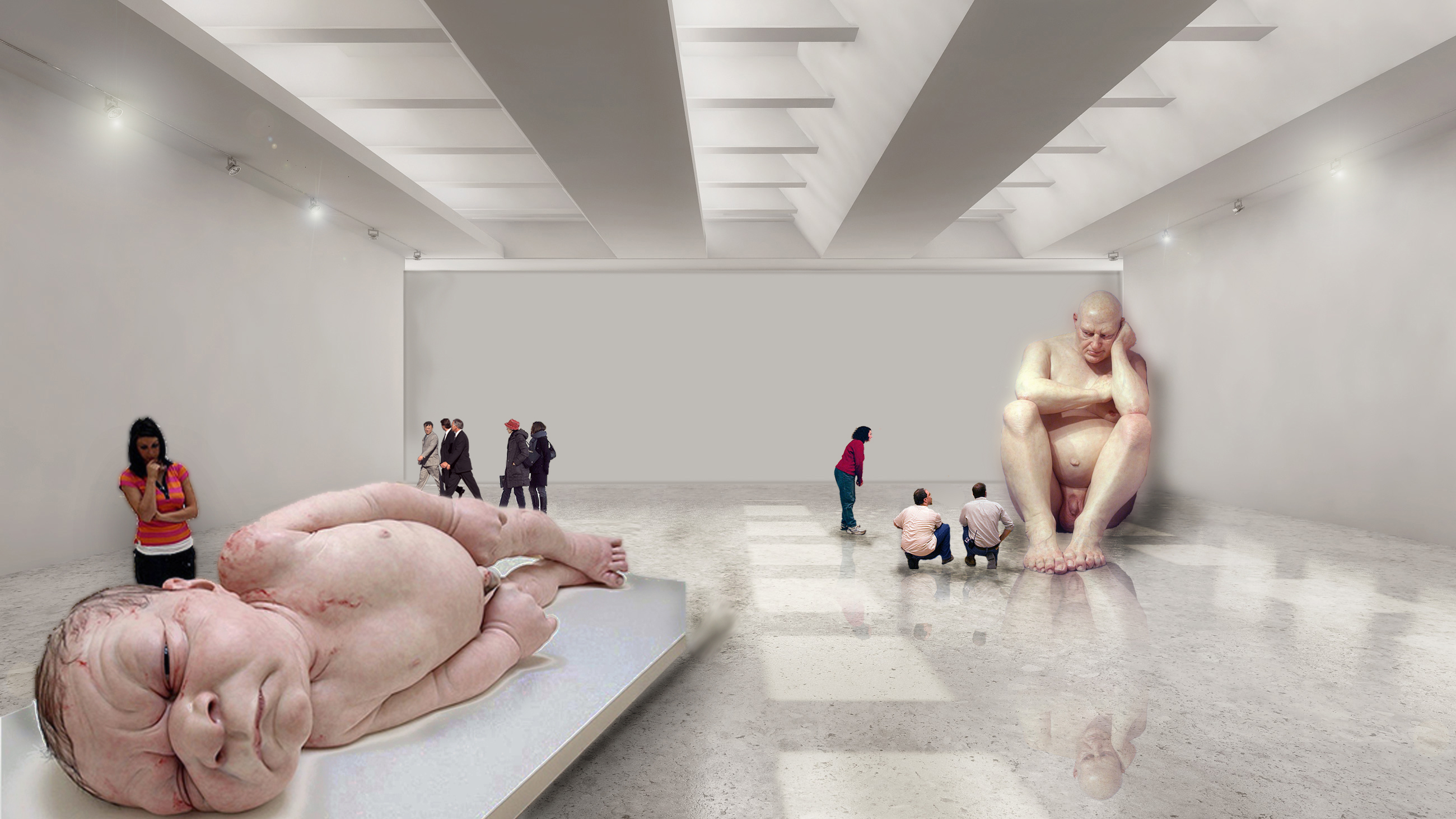
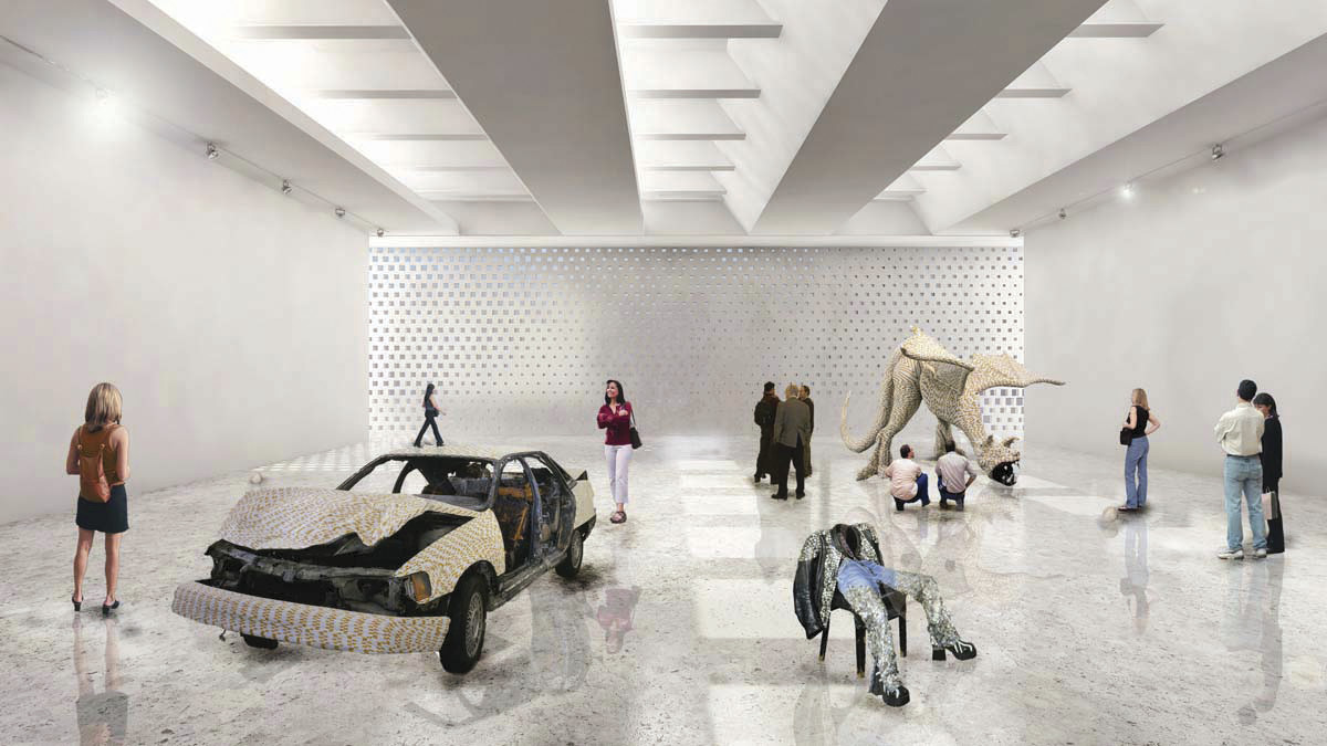
Understanding that contemporary art spaces pretend to be more important than the art they contain, our proposal arises from the scheme of requirements previously studied by our clients, assuring maximum functionality in each area while focusing on the development of art projects
Render © Glessner Group Courtesy of Rojkind Arquitectos
Render © Glessner Group Courtesy of Rojkind Arquitectos
By enhancing the program and understanding the topography, a balance between form, function and visual impact for this important space was created. Once the functional part was improved, we could pay attention to details that make the space not only a cultural enclosure, but also a building that understands its surroundings to distinguish itself and transform from a simple form to a powerful symbol, controversial, but ideal to lodge this new space.
When you ask contemporary artists what kind of space they would prefer to exhibit their work in – they almost always describe old industrial warehouses or loft spaces. It is the kind of space where they have their studios, but most importantly the rough structures, with large spans and generous ceiling heights provides them with the maximum freedom of expression.
Render © Glessner Group Courtesy of Rojkind Arquitectos
Render © Glessner Group Courtesy of Rojkind Arquitectos
On the other hand the museum director or the mayor might want an icon to attract visitors. So museum design is often caught in a dilemma between the artist’s demand for functional simplicity and the museum’s (and architect’s) desire to create a landmark. The cantilevering cross is the literal materialization of the cruciform functional diagram – devoid of any artistic interpretation. Tamayo Museum Atizapan Extension becomes the embodiment of pure function and pure symbol at the same time